Airsoft megastore
E-commerce platforms has drastically changed the way we shop. We can browse thousands of products, compare and filter through them and make a purchase right at our fingertips without having to get out of bed. When well-designed, an e-commerce platform makes shopping a breeze, builds trust, and encourages new and returning users to shop with confidence.
THE CONTEXT
Airsoft Megastore is a online retail platform for airsoft and military training equipment and weapons. I had the pleasure of working there as the first in-house researcher and UX designer. The initial assignment of simply redesigning the site quickly shifted as I found knowledge gaps and opportunities to address them through research.
THE PROBLEM
We had a great selection of products, competitive prices and known reputation. So why did our website generate traffic but the bounce rate was high? Our customers often required assistance from customer service while purchasing items through our website as well.
COMPETITVE ANALYSIS
Unfamiliar with the industry and common practices, I first set out to find what similar sites with great reputation do to better their customers’ shopping experience.
I gave myself a series of tasks to complete as a shopper on different sites, while scoring them on usability heuristics from the Nielson Norman Group.
It was clear that for the nature of our products, consistency of the brand’s visual assets and context-appropriate categorizations that match their usage in the real world were two of the most important traits those sites shared in common.

INTERNAL RESEARCH
To define more concrete objectives. I turned to the stakeholders and our team to conduct research within the team. I also wanted to use the opportunity to better familiarize myself with our products and the competitive landscape.
Card-Sorting
Card-sorting was the perfect tool to help improve our information architecture as logical organization of our many categories and subcategories was critical.
Interviewing members of other teams wasn’t just to better grasp the objectives from stakeholders. I believed it would be interesting to compare what our team “believed” about our users, with research data that showed what our users and customers actually did. This work clarified some false beliefs team members held, but were not aware of.
While the folks in the office provided valuable insights, they did hold very different beliefs about our users. For example while managers believed that most customers are “returning customers" and our top priority would be to focus on SEO and site search, developers and the marketing team thought “new customers” dominated our user-base and that having a more context-appropriate brand and feel was more important. As a result, their reorganization of our navigation and menu items during were very different.
Findings from the internal research were then turned into insights, analyzed to look for patterns and compiled into a list of design/research directions. Those new directions were then assigned a priority level based on frequency of appearance in my analysis. Although some patterns were elusive and less significant than others, they did help narrow down the scope of the next phase of research and inspired better questions to ask the users.
Shifting The Objectives
Following the initial round of internal research, I proposed shifting the priority to UX research first, after recognizing opportunities to not only improve the website look and feel, but also to make more data-driven design and business decisions.


NEW OBJECTIVES
The new objectives focused not only on improving the looks of the site but also on key breakdowns and user needs in other parts of the site and other aspects of the business:
-
Pinpoint and better understand the cause of high bounce rate and our customer’s frequent breakdowns and needs. What are the issues needing to be solved?
-
More relevant and meaningful ways to organize, prioritize and display information and functionalities. (Navigation, Menus)
-
Modern, consistent and context-appropriate look and feel.
USER RESEARCH
Data Collection
I aimed to collect quantitative data points that come from both returning and new customers representing diverse use cases and demographics. Just as important are the qualitative data that will help define the main personas and bring insight to discovering not only what they do but the “why” behind their behaviors.
How can we ensure half the subjects are returning customers and the other half new? Visitors from search engine can be of diverse backgrounds so I knew I needed to use a participant screener: Ethnio. To ensure the other half are returning users, I reached out for a list of emails from our sales department. And since we require a valid email to make any purchases, those emails for sure belonged to returning customers.
Based on Ethnio’s data and my calculations from Google Analytics. Taking into consideration drop-out rates, bots, and user location, I hypothesized that we can acquire 150 data points within a week.
After researching newsletter “open and click-through” rates, I calculated the number of newsletters needing to be sent out to generate the other 150 data points within a week. I also designed the study invites in the form of digital collaterals for social media platforms and email newsletters.
To easily manage different sets of survey questions that appeal to different users and personas, I used Typeform to create a responsive survey that directed subjects to different questions based on previous answers. Ethnio was used for the live intercepts, eligibility screener, as well as interview scheduling.
But what they users say they do is not always what they actually do. For qualitative data, with further incentives offered, I was also able to conduct 10 phone/webcam interviews, about 30 minutes each. To capture real moments of breakdown, I observed users’ behaviors in real time through screen sharing as I assigned them tasks to complete on the site while doing a “think aloud” whenever they ran into issues or displayed unusual behaviors or expressions.

Identifying Patterns & Insights
Problems and breakdowns discovered during research were organized into lists of functionalities and tasks to prioritize. The home page and checkout pages were the most problematic. According to data, almost half of our customers tried to contact customer service at some point, and a quick chat with the team revealed the checkout sequence to be a common complaint. Also according to data, the most useful functionalities to them were the search bar and navigation which the previous version’s space allocation did not reflect. Other actionable items included reorganization of the home page’s contents, new way to display product details and specifications, more filter options etc.

Other Key Insights
-
While we assumed images to be the most important asset for products with such fine details and parts, most users reported technical specs and pricing to be the most salient.
-
Most users selected “On Sale/Coupon” section to be the second least useful and salient but half the users also reported to buy something about half the time simply because it was on sale. “On Sale” section probably deserves more screen real estate now.
-
Less than half of our subjects reported to come to the site knowing exactly what they want, more people ended up buying something while randomly browsing. This means recommendations of products are extremely important on the site.


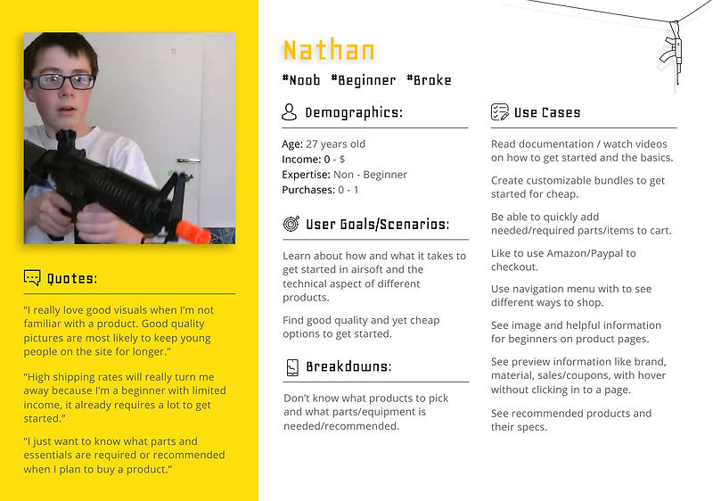
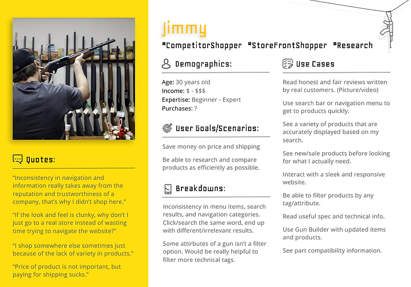
PERSONAS
Our data had clear patterns of responses that suggested some use cases to be more prominent than others. The previous priority list no longer reflected the actually answers recorded and needed to be updated as well.
Those user scenarios and use cases were then organized into 3 primary personas. Establishing the personas and presenting them gave stakeholders a better understanding of who the customers actually are.
I was able to update the priority list and further narrow it down based on how many of the personas were affected. Logically, the more often an aspect of the site affects users, the more I prioritized it and perhaps consider it a potential root of a bigger problem.
Shifting the focus to user research proved to be the right decision. Users rarely complained about the actual look of the site, but rather reported breakdowns while interacting with the site's functionalities and navigation.

My main focus for each persona:
-
Assist new users(beginner/new customer) in product discovery and introduce them to the sport.
-
Help returning super-users(experts/returning customer) find what they needed quickly.
-
Allow competitive shoppers to filter and compare products efficiently.

REDESIGN & SOLUTION
With new design directions supported by data, I started wireframing different layouts that reflected research findings.


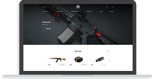
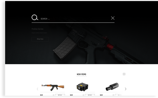
Meaningful Navigation & Salient Search
A newly designed navigation menu with hover animations and meaningful icons made the site more modern, simplistic and ecologically valid while a reorganized menu and information architecture from our card-sorting sessions made finding our products easier than ever. A tremendous amount of screen real estate was allocated to the screen bar to reflect its high frequency usage.

.png)
Easy Checkout
The checkout page carries a different color theme to signify transition into a different part of the site. The checkout process will now occur on one single page without requiring the user to click around to different pages. Space and location assignment of different modules is also allocated based on importance of information. For example, shopping cart content is now consistently displayed at the top right. Section completion status and location (breadcrumbs) within the entire process is also displayed at the top of each section.


Reorganized Homepage & Design System
Sections of the new home page were also were reorganized to encourage discovery of new products and on sale products. to welcome newcomers and introduce them to the sport.
From the menu to the player’s resources center to the checkout, the main pages of the new site now carried different messages and emotions which our users can now empathize with and form a brand identity around.
This was accomplished also by utilizing a new design system/style guide that I defined to the accessibility standard of WCAG level AA. The new colors, fonts, spacing, components all came together to give the site a face-lift while improving its functionalities and UI as well.


LOOKING BACK
In hindsight, I would have acquired even more robust data. If time allowed, I would have iterated on the survey and interview questions and conducted additional rounds of user research. Some findings from the first round of research left me with more questions than I started with. The 3rd persona also made me wonder if it should have been incorporated into the previous two, or broken down into an additional two since there were many overlapping use cases and scenarios.
Ideally, I would finish the rest of the site’s pages in order to conduct user testing. I would have given users a list of tasks to complete similar to the ones used during user research, to see if the changes made really made a difference. Tracking time taken to complete the task could product good data. Doing a think aloud again would also be valuable to iterate on the design. “Wizard of Oz” might be useful to test some of the more complicated and robust functionalities/features. Ultimately, tracking bounce rate on Google Analytics and even our sales conversion rate would be a good benchmark for the improvements my research brought.
Unfortunately the project had to be cut short before its completion to focus on a more urgent assignment. Nonetheless, it was still extremely rewarding as the stakeholders were happy with the work done and I got to impact not only the website but also other aspects and departments of the business. I got a first real glimpse into the effects my research can have outside of design. Leading the effort to establish style guides and design systems and communicating the importance to other teams meant that the marketing team now worked more closely with other departments to keep our branding materials consistent and photographers followed by establishing their photo guidelines. Stakeholders were now coming up with new business strategies targeting specific channels that appealed to specific personas I established. I also understood the importance of other team members' responsibilities in a multi-functional team as I was responsible for budgeting, project proposal and some aspects of project management.
I place a heavy emphasis on research in all the work I do. It always made sense to me that design is not just opinions, but rather a scientific process and effort backed up by data acquired systematically and at times creatively. This was a perfect opportunity to do the kind of work I believe in.